
Plates That Think Like Galleries
The form, color, and space turn cooking into design that guests can see before they taste
First Principles of Edible Composition
Every plate begins as a field where contrast, balance, and focus must agree, and a chef chooses a dominant element, a supporting rhythm, and a clear point where the eye settles, so flavor can follow a path that feels intentional from first glance to last bite.
Color Theory in the Pantry
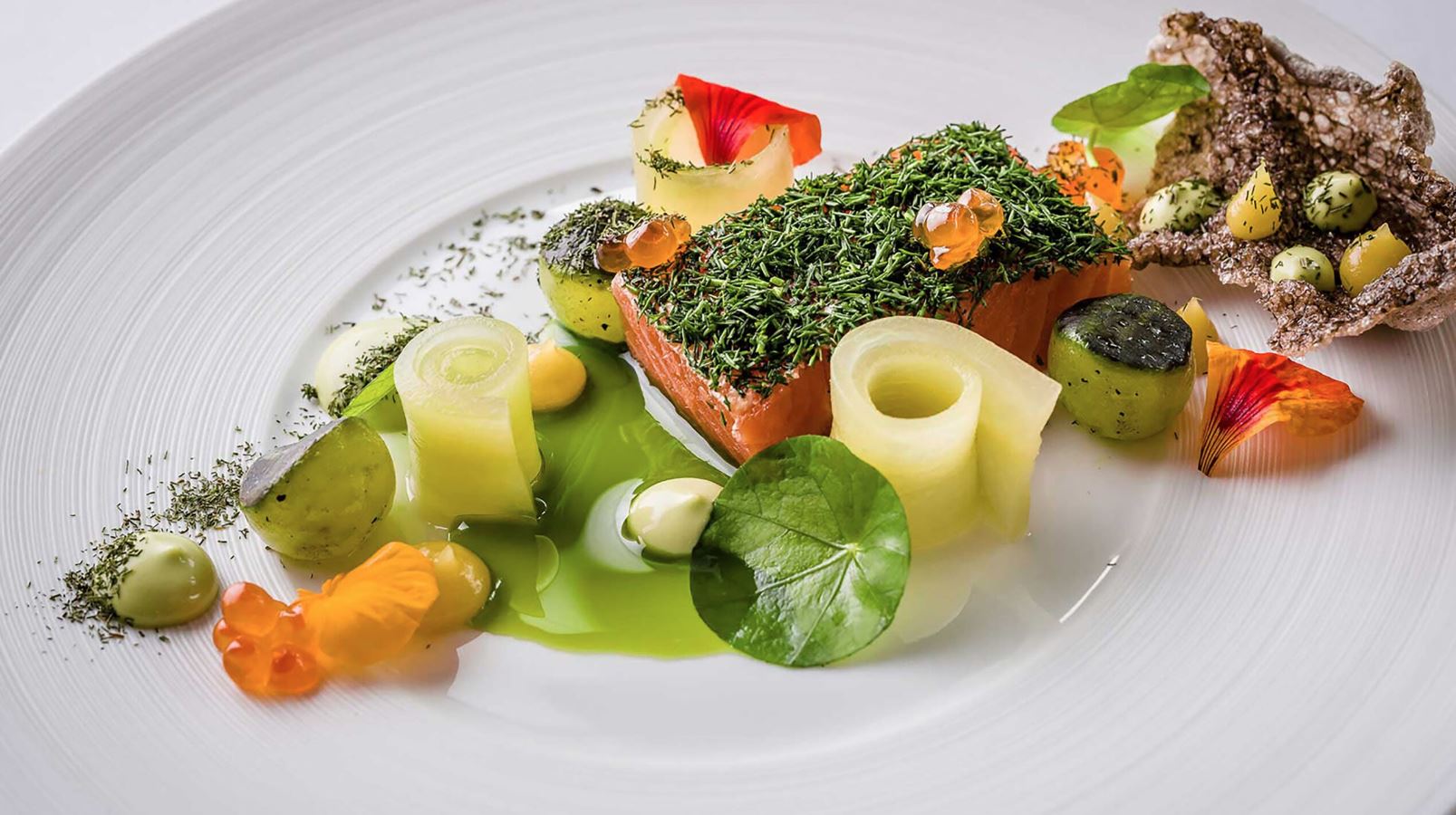
Vegetables, sauces, and crumbs provide hue and value the way paint does for a canvas, and smart teams pair warm roots with cool herbs, pale creams with dark reductions, and one bright accent that pulls the viewer toward the first forkful without shouting.
Negative Space as Ingredient
Empty porcelain is not waste, it is breath, and when a cook leaves a clean arc around a composition the eye relaxes, a sauce can glide, and the hand that carries the plate can place it without smearing the story that sits in the center.
Texture Stacking Without Clutter
Crunch, silk, and snap should arrive in measured layers, crisp shards beneath supple purée, airy crumbs above roasted flesh that flakes, and a cool element that resets the mouth, giving the diner a gentle turn of the wheel in every bite.
Height That Serves Heat
Towers for height alone fail when steam cannot escape or when edges cool before the core, so well judged elevation lifts aroma and keeps structure, while sloped plating invites the nose toward the warmest point where the first taste belongs.
Movement and Direction on Porcelain
Lines of sauce, seeds that drift, and a curl of citrus can guide the gaze from left to right like a sentence, and this visual grammar helps servers describe the plate easily, because a guest can follow the line while the words land in the ear.
Rule of Thirds for the Pass
Many plates feel natural when the main element sits off center at one third of the surface, the garnish rests on the crossing, and the sauce anchors the lower third, a simple grid that keeps freedom within a frame even during a rush.
Geometry in Cut and Carve
Squares signal strength, circles suggest comfort, and triangles imply motion, and a cook can change the mood of a vegetable or a protein by a single cut, turning sturdy into playful or calm into energetic with the angle of a knife.
Plateware as Silent Partner
Matte glazes calm glare and flatter greens, glossy finishes make reductions shine, shallow bowls cradle broths without drowning solids, and wide rims provide a stage for crumbs and oils, so the vessel becomes part of the composition rather than a frame that fights it.
Lighting That Honors Color and Steam
Warm lamps over the pass show true browns and golds, cool lights in the dining room brighten greens and whites, and a small step light under the pass helps catch stray splashes before they travel, preserving the clarity that design promised.
Knife Marks as Calligraphy
Even slices and clean turns tell a story about care, and the surface left by a blade becomes part of how light lands on a carrot coin or a scallop, making the tool work visible to the guest without a single word.
Garnish That Speaks and Stops
Good garnish either adds flavor or adds clarity, a herb placed where the bite needs lift, a citrus peel that returns aroma with heat, or a seed that provides a final click of crunch, and anything else stays off the plate so the message remains clear.
Saucework as Typography
Dots, swipes, and glazed pools are letters on a page, they must be legible, consistent, and paced, with the thickest stroke near the warm element and the thinnest near the rim, so each bite finds seasoning at the right moment.
Monochrome Plates and Quiet Power
Working within one family of color focuses attention on line and texture, a plate of whites and ivories can feel luxurious when gloss and matte converse, while a field of greens suggests freshness and energy without a single loud note.
Contrast as Drama Without Noise
Deep char beside dewy herbs, hot against cool, crisp under tender, this is where design wakes the tongue, and the cook learns to avoid hard clashes that tire the mouth, keeping contrast as a dialogue rather than an argument.
Warmth and Chill as Visual Cues
Condensation on glass, a whisper of vapor above a bowl, the glossy sheen on a chilled gel, these are signals that prime anticipation, and the plate should make the temperature obvious before the first bite arrives.
Symmetry When Calm Is Needed
Centered compositions help during tasting arcs that aim for serenity, a mirror of components creates stillness that suits broths, custards, and steamed fish, and the choice reads as hospitality for guests who want ease over shock.
Asymmetry for Energy and Flow
Placing weight to one side and letting a garnish trail into space adds life, and servers learn to set the plate so the motion points toward the guest, turning presentation into a small welcome that any seat can feel.
Season on the Surface
Spring speaks through tender greens and pale petals, summer through glazes that catch sun, autumn through burnished edges and thicker sauces, winter through grainy roots and glossy reductions, and a diner should guess the month by sight alone.
Sound as Part of Aesthetics
Cracks of brittle sugar, the soft scrape of spoon on custard, the faint sizzle from hot oil that meets herb at the table, these sounds complete the design the way texture does, coaxing anticipation through the ear.
Scent Trails and Microbursts
Zest cut at the pass, crushed herbs between fingers, a warm ladle across cool elements at the table, these acts release small clouds that reach the guest before the fork does, finishing the visual idea with aroma.
Toolpaths and Clean Lines
Design survives pressure only when stations place tweezers, spoons, and towels where hands expect them, and when every plate follows a repeatable path that keeps edges polished and centers undisturbed.
Accessibility as Design Value
Plates should photograph well yet also cut easily, sauces should be reachable without chasing them with a knife, and bowls should allow spoons to gather the intended ratio of elements, because beauty that resists the fork fails the guest.
Menu Layout as Visual Promise
Type size, line breaks, and white space set a tone that the plate must honor, a spare card suggests restraint and clarity, a playful layout hints at surprise and color, and the room feels honest when the design on paper matches the design on porcelain.
Brand Language in Dinnerware
Restaurants can choose plates that carry subtle cues, soft curves that reflect calm service, sharp rims for precision, earthy clays for hearth and field, and this language repeats from course to course until guests unconsciously read it.
Tabletop Harmony with Glass and Steel
Stemware height, water glass size, and the finish of knives and forks influence how a plate looks when it lands, and keeping metals consistent while glass remains clean and thin allows the food to stay foreground rather than lost among props.
Lighting Zones for Plating and Dining
The pass wants bright even light without tint so color reads correctly, the dining room asks for warmth and softness that flatters skin and sauce, and hallways require quieter pools that let the eyes rest between scenes.
Warm Plates and Cold Bowls as Framing
Temperature of the vessel shapes the gloss on fat and the set on gels, warm plates keep sauces fluid just long enough for the first tastes, while chilled bowls protect delicate textures that would sag under heat.
Composed Spoons and One Bites
Amuse courses allow design to compress into a single gesture, a tiny spoon with layered textures and a micro herb, a cracker with a sweep of cream and a seed, and the goal is clarity that introduces the house style in one second.
Grids for Prep and Flow
Back of house design matters as much as the plate, trays arranged in rows for garnish, labels always facing one direction, and portions set by weight and count so the hand remembers what the eye expects during the rush.
Color Stories Across a Tasting Arc
A long meal benefits from planned chroma, opening with greens and pale tones, rising into oranges and deep browns, and finishing with creams and jeweled fruits, a visual melody that keeps interest without fatigue.
Minimalism That Still Feeds
Restrained plates must maintain generosity, a small element can feel rich when surrounded by a thoughtful sauce and a warm scent, and bread or grains can support without stealing the scene, proving that less can satisfy when intent is firm.
Maximalism With Discipline
Busy compositions can delight if they carry a clear backbone, repeated shapes in varied sizes, a single color family across many textures, and one line of sauce that ties the chorus into a song rather than a shout.
Local Materials and Honest Surface
Porcelain from nearby makers, stones from regional rivers, and wood finished with food safe oils provide a surface that matches the story of the pantry, and guests sense this harmony even if they cannot name it.
Ergonomics for the Hand and the Tray
Design respects the person who carries the plate, rims allow confident grip, weight stays reasonable, and the center of mass remains stable so a corner turn does not shift the composition into chaos before the guest sees it.
Photographic Truth Without Tricks
Training staff to shoot dishes in natural light with neutral backgrounds creates an honest record that sets correct expectations, and this archive guides new cooks during training better than any paragraph can.
Iteration Without Erosion
Revising a design should increase clarity, not add noise, and teams learn to remove one garnish, sharpen one cut, or change one plate at a time, then taste and look again before the next nudge forward.
Cross Cultural Respect in Visual Motifs
When inspiration comes from another place, credit appears on the menu, shapes and service rituals follow guidance from those who know, and the design avoids costume, allowing admiration to live beside accuracy.
Sustainability Woven Into Looks
Beauty grows when trim becomes crisps, when stems become oils, when bones and skins become glossy sauces, because thrift shapes the plate with intelligence, and diners sense purpose beneath the shine.
Children at the Table and Scale
Small hands need plates that keep elements close and tools that match their grasp, and design that considers young diners earns families who return and a future audience that learns to love careful food early.
Color Temperature in Oils and Glazes
Golden oils cool toward green as they thin, reductions shift from ruby to garnet as they set, and designers in kitchens learn these tiny changes to time the walk from pass to table so the plate lands at its visual peak.
Shadow as Ingredient
Shallow lips and raised elements cast soft shadows that carve depth into a flat surface, and this relief helps a camera and a human eye read texture, making leaves look lively and edges appear crisp without heavy filters.
Lines That Invite Knife and Spoon
The cut path should be obvious before contact, steaks angled with grain visible, fish flaked in a direction that welcomes the fork, and pastry sliced so the first motion reveals a clean interior, making the guest feel skillful and at ease.
Ingredient Typography on the Plate
Larger elements act as headlines and must be flawless, small elements are the body text that adds detail, and punctuation arrives as seeds, herbs, and fine salts that end the sentence with a pleasant finish on the lips.
Glaze Weight and Sauce Shine
Thick glazes read heavy under bright light, thin glazes can look watery, and the right middle gives a subtle gloss that suggests moisture without slip, telling the guest that the bite will carry flavor without mess.
Seasonal Ceramics Rotation
Summer plates with wide wells and pale tones make fruits and herbs sing, winter plates with deeper bowls hold broths and braises, and this rotation keeps the dining room visually in step with the pantry and the weather.
Salt Crystals as Light Catchers
Finishing salts with varied shapes sparkle under lamps, flakes for gentle pop, pearls for crunch, powders for fast melt, and the selection should match moisture and fat on the plate to avoid glare and to maximize sensation.
Edible Inks and Natural Dyes
Beet, spinach, annatto, and squid free char create safe tints for oils and gels, allowing lines and dots that carry flavor while stating color, and these choices keep the palette clean without resorting to artificial tones.
Table Height and Plate Horizon
Chairs and tables set the vantage point, and dishes designed for a high horizon should tilt components up, while low seating allows flatter compositions to read clearly, proving that furniture and food share a single frame.
Service Pace as Visual Rhythm
Long pauses dull memory of the last image and crowd the next, short gaps can blur detail, and the ideal cadence leaves room for talk while keeping the gallery moving from course to course with gentle curiosity.
Training Eyes with Museums and Fields
Line cooks and servers benefit from time in galleries to study composition, and from time in gardens to study color in sun and shade, because the best plates borrow order from art and energy from soil.
Final Wipe and the Promise Kept
A single swipe with a hot damp towel near the rim honors every choice made before it, keeping the border clean, preserving the negative space, and telling the guest that the kitchen respects the story it just told.
The Plate That Says Thank You
At the end of the night the most beautiful dish is the one that arrives clear in intent, generous in portion, comfortable to handle, and memorable in scent and sound, a quiet union of craft and care that lets the guest feel seen and satisfied without needing an explanation.